Achieving the Perfect Balance Between Colour Accuracy, Brightness, and Viewing Comfort Explained
Screens have become a ubiquitous part of our lives. Whether on our desks, in our bags, or in our hands, if you work or play on a computer, you are constantly navigating how different screens perform. From productivity to eye strain to simple UX enjoyment, display quality is important to just about everyone—from professional designers to gamers, students, and remote workers.
But what if your screen delivered strong performance in every department?
Modern display engineering increasingly focuses on three core areas:
-
Color accuracy
-
Brightness performance
-
Viewing comfort
Balancing these elements into a single display has traditionally been difficult. However, newer display approaches aim to reduce the trade-offs that once forced users to choose between visual quality and comfort.
Explaining the Display Technology Behind Balanced Performance
Advanced OLED-based display systems are designed to maximize visibility while minimizing eye strain. By combining refined light diffusion, careful color calibration, and built-in eye-care features, these displays deliver consistent image quality across wide viewing angles.
Unlike conventional LED panels that prioritize raw brightness at the expense of comfort, this approach focuses on balancing:
-
Sharp, accurate colours
-
Practical brightness levels
-
Comfortable long-duration viewing
Understanding why each element matters helps explain how modern displays achieve a more complete viewing experience.
Balancing Colour Accuracy and Brightness for Superior Display Quality
Too often, screens excel in one area while compromising another:
| Display Focus | Result | Drawback |
|---|---|---|
| High Brightness | Clear outdoors | Eye strain |
| Color Accuracy | True visuals | Often dim |
| Eye Comfort | Reduced fatigue | Washed-out colors |
A balanced display approach removes these compromises by optimizing all three simultaneously.
Colour Accuracy: Seeing True-to-Life Colours
Accurate colour reproduction is essential for both professional and everyday use. Designers, editors, and casual users alike benefit from displays that present visuals as intended.
High colour accuracy is achieved through:
-
Advanced calibration techniques
-
Wide color gamut coverage
-
Precise RGB tuning
-
Stable contrast ratios
These elements work together to ensure smooth gradients, accurate shadows, and realistic color representation—whether the display is used as a primary screen or a secondary monitor.
Brightness: Visibility in Any Lighting Condition
Brightness should adapt to the environment—not overwhelm it. A well-designed display delivers clarity in bright rooms while remaining comfortable in low-light conditions.
Key features that support this balance include:
-
Carefully controlled luminance
-
Anti-glare surface treatments
-
Light diffusion layers
-
Fine-tuned brightness adjustment
The result is clear visibility without excessive glare or flicker.
| Feature | Traditional LED | Balanced Display |
|---|---|---|
| Peak Brightness | High | Controlled |
| Eye Comfort | Low | High |
| Glare Control | Minimal | Advanced |
| Night Viewing | Straining | Comfortable |
Eye Comfort: Reducing Digital Fatigue
Extended screen time can lead to eye strain, headaches, and blurred vision. To address this, modern displays integrate features designed to reduce common stressors, such as:
-
Excessive blue light
-
Screen flicker
-
Harsh brightness
-
Nighttime glare
Comfort-focused displays typically include:
-
Low blue light modes
-
Flicker-free operation
-
Soft light diffusion
-
Matte screen finishes
These features support longer, more comfortable sessions for work, study, and entertainment.
Achieving Balance Through Design
What sets a well-balanced display apart is not any single specification, but how each element works together.
| Element | Optimization Focus |
|---|---|
| Color Accuracy | Professional-grade |
| Brightness | Eye-safe |
| Comfort | Long-session friendly |
| Viewing Angles | Wide and stable |
| Energy Efficiency | Optimized |
This design philosophy delivers reliable performance without forcing compromises.
Practical Usage Scenarios
For Graphic Designers and Professionals
Accurate color and stable contrast allow for confident editing and content creation.
For Gamers
Smooth color transitions, consistent brightness, and reduced eye fatigue enhance long gaming sessions.
For Students and Remote Workers
A high-quality secondary display improves multitasking, document reading, and video conferencing.
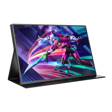
For Portable Workflows
Lightweight displays with consistent image quality support productivity on the go.
Touchscreen Compatibility Without Compromise
The touch screen monitor works seamlessly, and touch interaction doesn’t need to reduce visual quality. Well-designed touchscreen displays maintain:
-
Sharp image clarity
-
Accurate colors
-
Consistent brightness
-
Comfortable viewing angles
This ensures usability without sacrificing performance.
Protecting Your Eyes During Daily Screen Time
Screen use is unavoidable. Displays designed with comfort in mind help users:
-
Reduce blue light exposure
-
Minimize headaches
-
Control glare
These features support healthier screen habits over time.
Conclusion
Finding the sweet spot between color accuracy, brightness, and viewing comfort is essential for modern displays. NxtLED™ technology achieves this balance by delivering clear visuals, controlled brightness, and eye-friendly performance without compromise. Whether used in a primary display, a touchscreen monitor, or as a portable second screen, it offers a comfortable and reliable viewing experience suited to everyday life.