While a rebrand represents a major change in strategy, the best rebrands can target new customers while retaining the loyalty of old ones.
CEO Today hears from Paul Taylor, Chief Creative Officer and Partner at BrandOpus, who shares his advice for how large businesses can successfully rebrand.
In an increasingly competitive marketplace, where consumer loyalty is far from guaranteed, a powerful brand identity can be the difference between purchase and dismissal. With so many conflicting consumer needs, interests and design trends to contend with it can be hard to know where to start. Overwhelmed, brand custodians often make the mistake of throwing the brand out with the bathwater to try and ‘fit in’ to the latest zeitgeist. The trouble is, fitting in usually means failing to stand out.
As with any big business decision – and, make no mistake, rebranding is one of the biggest decisions you can make for your business - the best course of action is to take a step back from the noise. Instead of seeking to identify what isn’t working, which is typically subjective, identify instead what truly makes the brand what it is, and elevate that.
There is science behind this approach. An understanding of cognitive neuroscience can help us unpick which elements of a brand are truly resonating with the consumer on a subconscious level. Coupled with the practice of semiotics analysis, which enables us to understand the cultural meaning behind specific design cues, the creativity behind a rebrand can be supercharged with a robust, actionable framework and insights.
Cognitive neuroscience tells us that visual identities and language create shortcuts in consumers' memories; a trigger, so to speak, that leads directly to all the associations they already have with that brand. These associations are built up over a long period of time and drawn from a variety of sources of experiences. Many of them are often intangible, located deep in our subconscious memory. Ultimately, a brand is a visual construct and it’s up to brand custodians to understand how it is put together in the mind of the consumer.
As with any big business decision – and, make no mistake, rebranding is one of the biggest decisions you can make for your business - the best course of action is to take a step back from the noise.
The visual identity of a beer brand, for instance, could trigger the positive but ephemeral associations of a warm summer’s day or the joy of a moment shared with friends. A lack of understanding of which specific elements are triggering these associations means risking getting rid of the most valuable brand assets you have – and which will take time and effort to replicate in the consumers’ mind.
The good news is that this doesn’t preclude embracing the new; indeed, our experience has taught us that the choice between an evolutionary or revolutionary brand redesign – the “Go Big or Go Home” mentality – is a fallacy. In fact, identify correctly what the most valuable brand assets are and you can adopt what is outwardly a bold brand refresh while still bringing your consumers along with you.
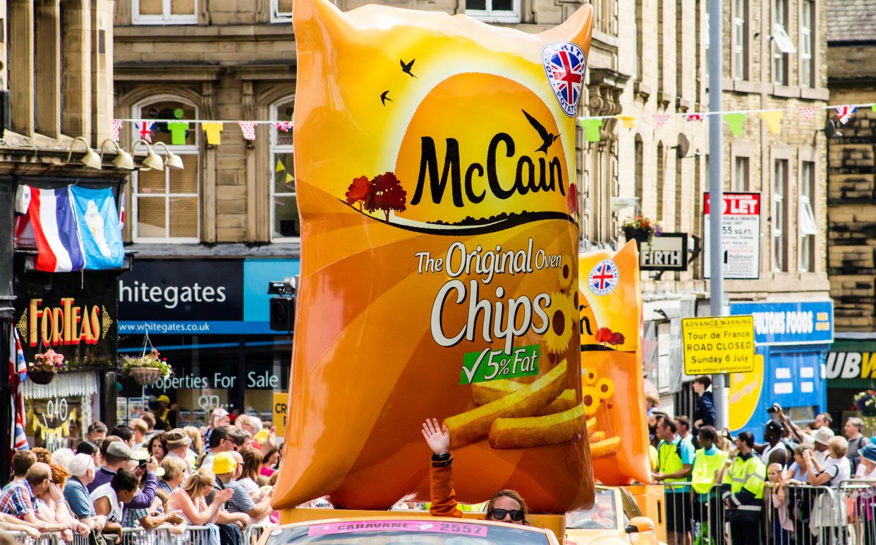
This is an approach McCain successfully adopted when it undertook its first global identity rebrand in 50 years, shifting perceptions of the brand to make it relevant to today’s consumers whilst also enabling the business to successfully extend its product portfolio. A rising sunshine logo was introduced – entirely new brand iconography for McCain – adding a warmth that had previously been missing, whilst retaining existing brand equities through the careful evolution of the brand’s typography and colourways. The change created a significant shift in brand associations and meaning and has enabled McCain to move into new, previously unattainable, innovation territories.
Molson Coors Beverage Company has assessed more than one brand in its portfolio this way too, including British beer icon Carling and, more recently, Miller Genuine Draft in the US. For Miller Genuine Draft, the visual identity of the brand was completely reshaped in order to boost market share with a new, younger audience whilst maintaining a strong connection with its legacy consumer cohort.
[ymal]
This didn’t mean losing the essence of the brand however – far from removing them, the redesign elevated the brand’s distinctive assets and put them in the foreground. Captured at the heart of the identity is the Miller Genuine Draft eagle, spotlighted against a red backdrop and positioned as a true brand mascot.
Critically, such rebrands do not happen in a closed conference room. The most important indicator of a successful brand redesign is that customer believes it is the brand they have always bought. And understanding of brand meaning on a subconscious level means that your brand refresh can be both evolutionary and revolutionary at the same time – boosting market share with new customers, whilst taking your existing ones on the journey with you.